
Muesli Packaging Concept
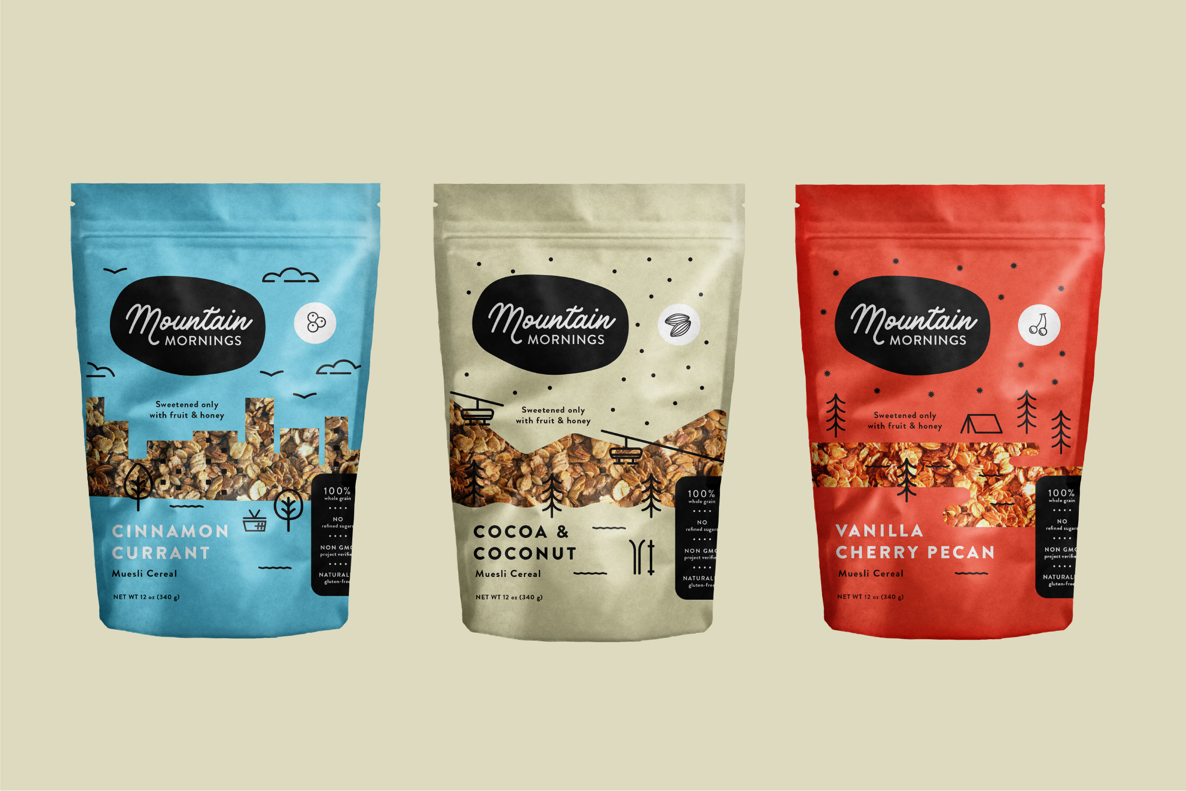
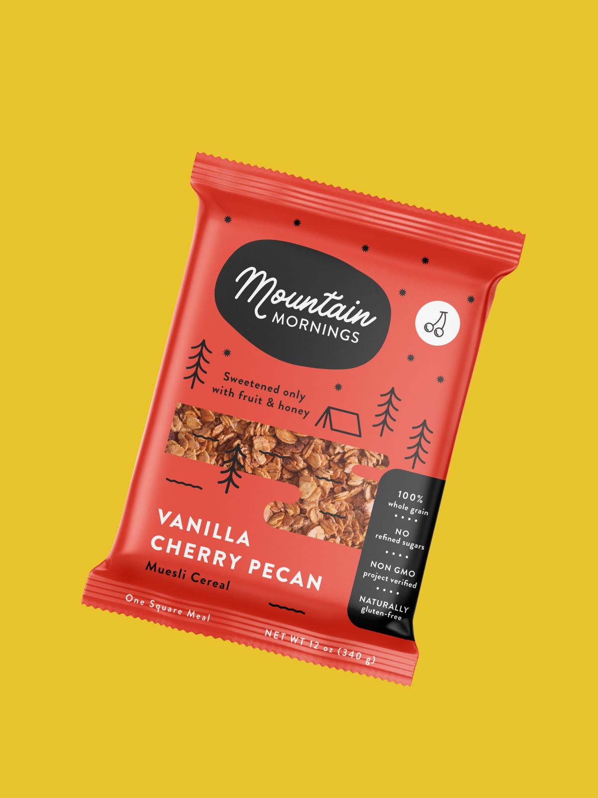
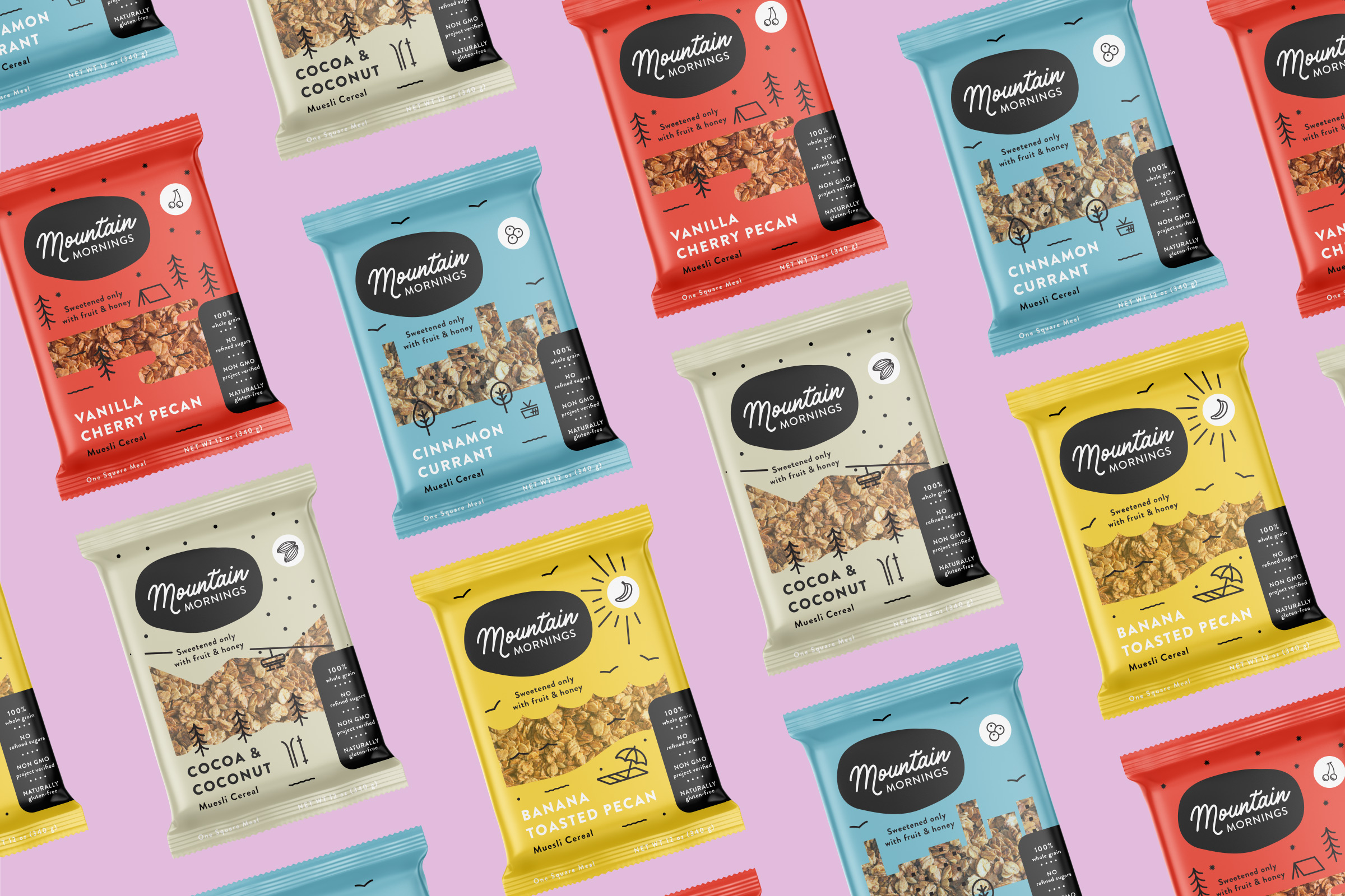
A local muesli brand approached us to update their existing packaging designs. The small business, run by a husband and wife team, was looking to expand their reach in stores and have their product stand out from the rest of the muesli brands. We presented several directions, some closer to the existing designs, and others that featured illustrations. This unused concept uses bright colors and playful illustrations to represent both the playful flavors, but also to emphasize the healthy and adventurous lifestyle the brand represents. The client eventually decided to forgo new branding.
Role: Lead Designer • Art Direction: Dan West • Designer: Tyler Dehague
